Barrick Lab Style Guide for Figures
General Workflow
- Use a program (Excel, R, CIRCOS, matplotlib, etc.) to graph your data.
- Output a file in a vector graphics file format (SVG or PDF).
- Integrate the graphs into an annotated figure in Adobe Illustrator.
- Change the font of all labels to Arial or Helvetica
- Resize symbols and fonts so that they look good in proportion.
- Remove all grid lines.
- Outline the graph area with a box.
- Change all line widths (axes, box) to 1 point.
- Remove the border around the whole graph area.
- Remove all shadow effects.
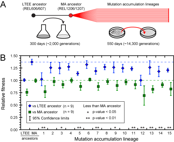
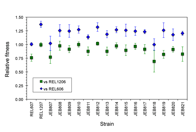 This is the final figure created by importing this graph into Adobe Illustrator. Notice:
 - The line widths of error bars and ticks have been further adjusted for better visibility.
- Shadow effects have been removed.
- The legend has been expanded.
- Horizontal lines showing the averages of each time series have been added.
- The names have been changed from abstruse strain numbers into simple numbering.
- A panel describing the overall experiment has been added.
General Guidelines for Figures
- Fonts
- Always use Arial (or Helvetica).
- Avoid font sizes smaller than 6 pts as much as possible.
- Generally label figure subparts with capital bold letters of 12-14 pt size.
- Use CMYK color. This is what journals use for print copies.
- Blues, in particular, look much different than in RGB space.
- Generally, DO NOT use:
- Shadows, halos, etc., or other shading effects. Be aware that this is the default in many Microsoft programs.
- Cross-hashing. There can be odd effects when printing close cross-hashes.
- More than one kind of dashed line.
What type of graph should I use for my data?
- Types of data
- Relative fitness
- Expression levels
- Mutation rates
- Don't use bar graphs when a log scale is the natural scale.
What type of error bars should I use for my data?
- See this helpful article for differences between standard deviation, standard error, and confidence intervals:
- Cumming G, Fidler F, Vaux DL. 2007. Error bars in experimental biology. J. Cell Biol. 177:711. «PubMed»
- Use 95% confidence intervals when comparing sets of measurements on a graph (e.g., fitness values).
- Use standard deviations when graphing values where you merely want to show the range of values observed across several replicates (e.g., OD values at one point on a growth curve).
Using Excel to Create Graphs
- Differences from Excel defaults
- Remove black box from the outside of the graph.
- Remove horizontal dividing lines.
- Outline graph area and make axes use 1 pt black lines.
- Change the default font to Arial or Helvetica before exporting. Other fonts (including the Calibri default!) can change into random symbols when loading into Illustrator.
Creating Figures in Adobe Illustrator
- Imported graphs.
- Be careful to only perform isomorphic transformations on imported graphs. Obviously it is important to preserve the exact locations of ticks relative to data.
- Since you can determine the exact pixel locations of what you draw in Adobe Illustrator, you can calculate exactly where to place extra features in the context of your graph.
This topic: Lab > WebHome > ProtocolList > ProtocolsGraphGuide
Topic revision: r4 - 2013-09-20 - JeffreyBarrick