| |
| META TOPICPARENT |
name="ProtocolList" |
|
|
>
> | Barrick Lab Style Guide for Figures |
| | |
|
<
< |
- Differences from Excel defaults
|
>
> | General Workflow |
|
<
< |
-
- No horizontal dividing lines.
- Outline graph area and make axes use 1 pt black lines.
|
| | |
|
>
> |
- Use a program (Excel, R, CIRCOS, matplotlib, etc.) to graph your data.
- Output a file in a vector graphics file format (SVG or PDF).
- Integrate the graphs into an annotated figure in Adobe Illustrator.
As an example...
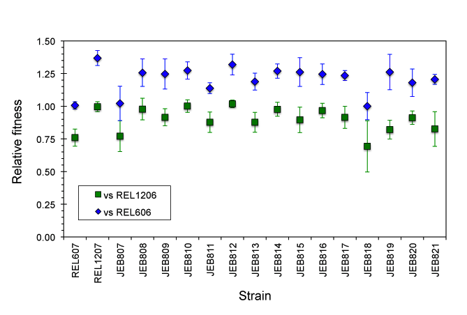
This is a figure created in Microsoft Excel of two sets of fitness measurements.
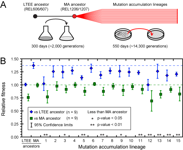
 This is the final figure created by importing this graph into Adobe Illustrator. Notice:
- The line widths of error bars and ticks have been adjusted for better visibility.
- Shadow effects have been removed.
- The legend has been expanded.
- Horizontal lines showing the averages of each time series have been added.
- The names have been changed from abstruse strain numbers into simple numbering.
- A panel describing the overall experiment has been added.
General Guidelines for Figures
- Fonts
- Always use Helvetica or Arial.
- Avoid font sizes smaller than 6 pts as much as possible.
- Generally label figure subparts with capital bold letters of 12-14 pt size.
- Use CMYK color. This is what journals use for print copies.
- Blues, in particular, look much different than in RGB space.
- Generally, DO NOT use:
- Shadows, halos, etc., or other shading effects. Be aware that this is the default in many Microsoft programs.
- Cross-hashing. There can be odd effects when printing close cross-hashes.
- More than one kind of dashed line.
What type of graph should I use for my data? |
| | |
|
>
> | |
| |
-
- Expression levels
- Mutation rates
|
|
<
< | Avoid bar graphs for expression data or mutation rates. |
>
> |
- Don't use bar graphs when a log scale is the natural scale.
|
|
>
> |
Using Excel to Create Graphs
- Differences from Excel defaults
- Remove black box from the outside of the graph.
- Remove horizontal dividing lines.
- Outline graph area and make axes use 1 pt black lines.
- Change the default font to Arial or Helvetica before exporting. Other fonts (including the Calibri default!) can change into random symbols when loading into Illustrator.
Creating Figures in Adobe Illustrator
- Imported graphs.
- Be careful to only perform isomorphic transformations on imported graphs. Obviously it is important to preserve the exact locations of ticks relative to data.
- Since you can determine the exact pixel locations of what you draw in Adobe Illustrator, you can calculate exactly where to place extra features in the context of your graph.
| META FILEATTACHMENT |
attachment="example_1_excel.png" attr="h" comment="" date="1346175659" name="example_1_excel.png" path="example_1_excel.png" size="35185" stream="example_1_excel.png" tmpFilename="/usr/tmp/CGItemp43994" user="JeffreyBarrick" version="2" |
| META FILEATTACHMENT |
attachment="example_1_illustrator.png" attr="h" comment="" date="1346175517" name="example_1_illustrator.png" path="example_1_illustrator.png" size="35933" stream="example_1_illustrator.png" tmpFilename="/usr/tmp/CGItemp44334" user="JeffreyBarrick" version="2" |
|
| | |